Video | Using a Limited Color Scheme with Allison Waken
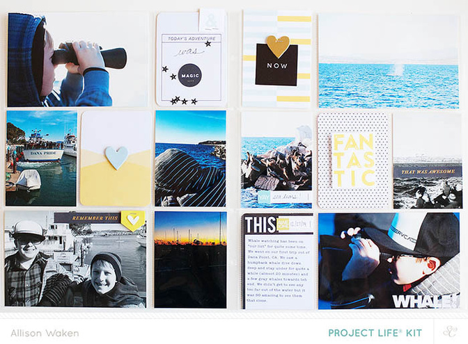
Tags:This spread is all about a whale watching trip we took in December. Obviously there is a lot of blue so I went with blue black/white (counting neutrals as 1) and yellow. Limiting your supplies can help speed up your process a bit while getting you to stretch your creativity.
Listen as I explain my process in this video!
Supplies: kits - Studio Calico Cirque Project Life® KitCirque Printable Journal Cards In A Creative BubbleCirque Printable Journal Cards Hello Forever9x12" Page Protector 3B


Comments
Sign in or sign up to comment.
5 comments
Love to see your process! Thank you for the video. I love the simple style with the photo's being your story. Lovely!
Replies to 1Djc
Sign in or sign up to reply.
Fantastic video and walk through @AllisonWaken! I pretty much follow the exact same process, but I need to start using a ruler for my alphas like that! Great idea!
Replies to donyaluana
Sign in or sign up to reply.
Thank you for this!
Replies to Roberta
Sign in or sign up to reply.
love the video and also the color combo that you choosed
Replies to geekgalz
Sign in or sign up to reply.
Beautiful, Allison!
Replies to welobellie
Sign in or sign up to reply.