Hello! Today I'm taking you through the creation of my Sunshine Girl layout and want to focus specifically on the design elements.
Enjoy!
Tips & Tricks:
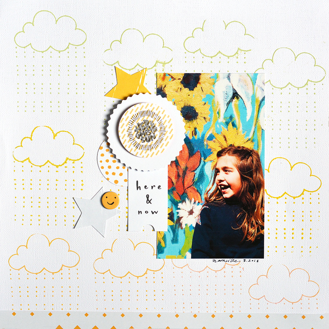
- Starting with a strong image with vibrant colors here accomplishing half the work. Plus, it allowed me to use black and white embellishments to create contrast. Be sure to punch up color, brightness, and contrast when editing these kinds of images for pop factor.
- I used the silkscreen and Color Theory paints to create a base for my background (I did this before the video to allow for drying!). I used the design in a repeated pattern. I used all three paint colors and didn't bother to clean the screen between colors for a blended look. Try it sometime; it gives a hint of ombre.
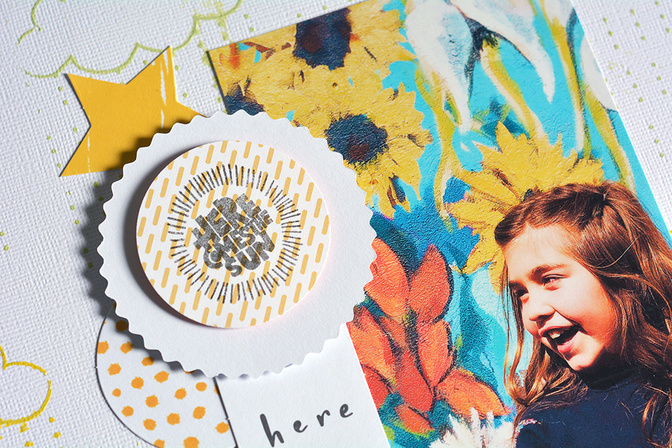
- I wanted the title to create dimension and to tie colors from the image to the embellishments. I layered my stamped circle of patterned paper and the backside of a die-cut with foam squares to add lift to the page. Don't be afraid to use kit items in ways they weren't intended.
Thanks so much for stopping by. As always, I hope this gave you some inspiration to create! Please let me know if you have any questions about this project. I'm here to help!


Comments
Sign in or sign up to comment.
1 comment
What a gorgeous layout!!
Replies to msmeinke
Sign in or sign up to reply.