Using the Expedition Kits with Marcy Penner
Tags:Hey, everyone—Marcy here today. I’m all for keeping things simple (as a lot of you know by now). With that means being selective in the supplies that I choose to use on my project. They have to be purposeful and no fuss. So today I’m here with a little tip on how to create a quick and simple spread with intention.
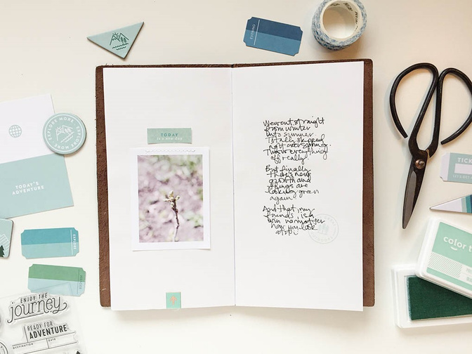
For this spread in my notebook for the June gallery, I decided to build off of a monochromatic color scheme.
This is a great way to make use of all those supplies in your stash but it can also result in a quickly pulled together spread. The trick for success, though, is to be intentional with your choice of products. Just gathering a bunch of stuff and slapping it on can result in a hot mess if you’re not careful. Be careful to look for elements that reflect your topic or can be used in creative ways to convey your message for the best results!
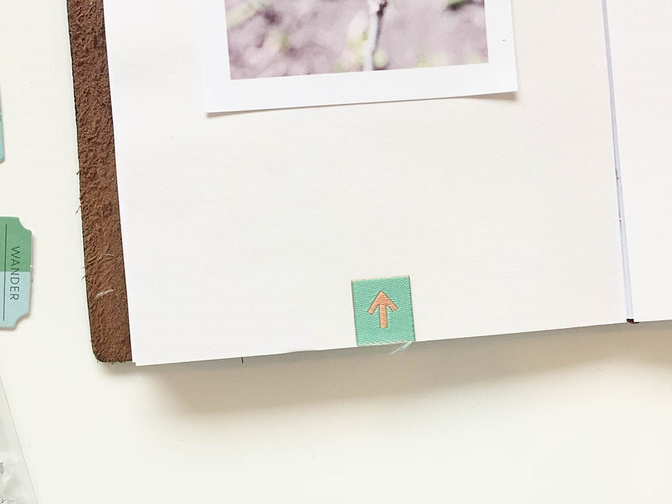
Tip: Adding in a visual triangle will bring widely-spaced and similarly-colored embellishments together. In this spread, I have three blue/mint items (title, stamp, arrow tab) across two pages in a triangle shape that bring your eye all the way around the page and keep everything in a nice package.
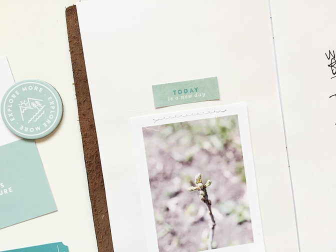
My spread, for example, focuses on spring FINALLY arriving, and yet you can see that I steered clear from embellishments with leaves or flowers. Instead, to convey the new growth in my photo, I used a simple fabric tag positioned at the bottom of my page and pointing up. Just that subtle little embellishment in keeping with my color scheme supports the theme of blooming in spring and reinforces my story.
A monochromatic color scheme with purposeful choices in embellishments is a great way to end up with a cohesive spread that’s easy, meaningful, and fun. Give it a try!


Comments
Sign in or sign up to comment.
0 comments
No comments yet — be the first!