Using the Lost River Documenter Kit with Kelsey McEvoy
Tags:If you're signed up for the Lost River Documenter Kit workshop, you've already heard me say this. If you're not signed up for the workshop, then get ready for some real talk: This kit was HARD for me to work with. It was the first kit in almost two years that I just wasn't excited by. The colors are perfect for fall (which is perfect because it's September's kit), but my entire life revolves around spring and summer and bright, bold color. Figuring out how to make the colors in the kit work for me was an enormous challenge.
BUT...I DID IT! I'm actually pretty in love with this project, and I hope you like it, too! At the very least, if you're someone who prefers brighter, more spring-y and summer-y colors, I hope you can find some inspo from my project on how to make September's kit work for you :)
Here we go...
I wasn't sure what to document with this kit, but I knew it'd be between our love of Tropical Smoothie or our love of &pizza. I actually started making this layout for Tropical Smoothie, but then remembered those rad ampersand paperclips are included in the main kit and switched gears.
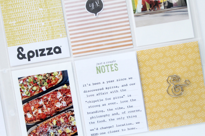
That's right – the "&" paperclip sold me, and I decided to make a layout documenting our obsession with &pizza, the most amazing pizza joint on the planet. SERIOUSLY. It's only here in D.C., but it's the greatest – their philosophy, their branding, their food. And the coolest part? It's basically Chipotle for pizza. You start by ordering your dough, then your sauce, then your cheeses and any toppings + extras. You watch them pass it down the line and make it right in front of your eyes. Really awesome!

One of the only locations they have outside the actual city of D.C. is in Northern Virginia, at the Springfield Mall. It's like 15 miles from our house, but we still regularly and willingly drive there because YUM.
I used photos from three different visits for this layout. I wasn't concerned with making sure everything included in the layout came from the same visit – I was concerned with documenting our long-standing love for the place, and felt the best way to do that was to use photos from multiple visits.
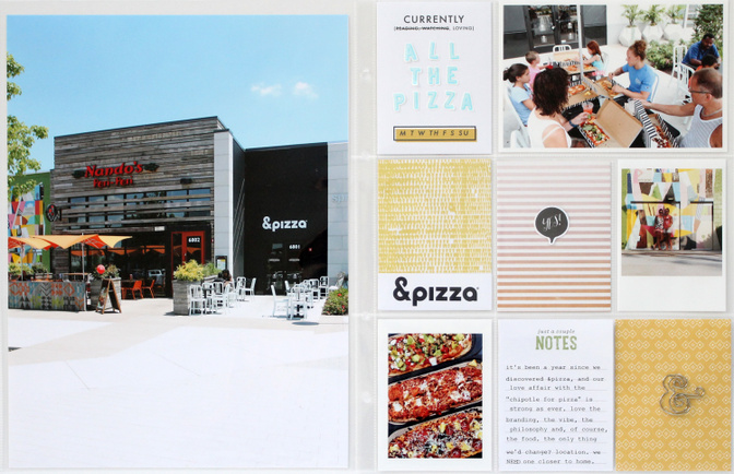
The large photo on the left was taken back in June. I lucked out and got in a quick snap before the sidewalk crowded with mall-goers!
To fill in the nine 3x4 pockets, I started by pulling out from the main kit all of the cards that fit my aesthetic (apologies for the wonky coloring; had to work with some late-evening lighting):
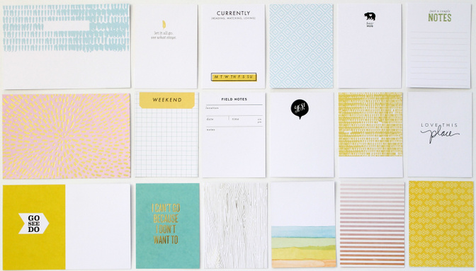
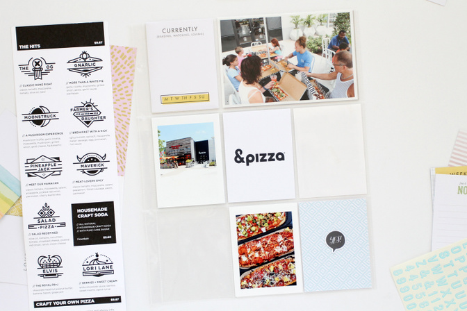
Next, I went through and set aside the cards whose phrases or general "vibe" fit my "style," and I got to work from there. I started with JUST the single 9x12 page – the one with nine 3x4 pockets – and that 4x6 photo of all of us eating (we took my mom and her hubs to &pizza their first full day in town a few weekends back and they LOVED it too). Then, I printed out the photo of the exterior of &pizza as a 3x4 and first tried to make the project work with just a single 9x12 page. I also printed out a close-up "from above" shot of some of our pizzas.
I was set on using the "Currently" card from the jump, so I slipped that in the first 3x4 pocket and kept going.
First, I played with the blue patterned card from the kit, pulling from the blue sky in the &pizza exterior photo and the blues in the 4x6 photo up top.
The blue card was fine, but the page didn't feel "grounded" with SO much "lightness," so I took a look at what the page looked like with the yellow patterned card. Plus, I was pretty sure at this point that I was going to use a full 9x12 photo of the &pizza exterior, and knew that with the blue sky being magnified on a larger canvas (a full page 9x12 photo v. a 3x4 photo), the blue patterned card paired with the blue in the 4x6 photo would lack the visual "oomph" I was going for and be almost mundane.
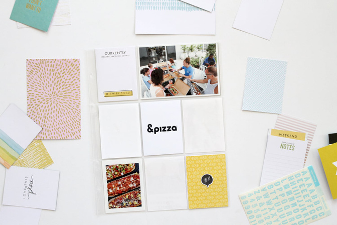
I really liked the yellow card in the bottom right pocket, especially since it pulled some of the yellow and orange tones from the up-close photo of our pizzas. And I knew it'd work well with a timercam selfie of Shannon and me from our first-ever trip to &pizza last summer, which I planned to include in the project.
(PS: That "yes!" bubble is just cut out from the top of a 3x4 card in the kit.)
From here, I just played around with elements until I got 'em how I liked 'em.
I ended up moving the "yes!" bubble to the center pocket, using the alphas included to spell out "all the pizza" on the "currently" card (I just used a pen to cross out "reading, watching"), slipped in the selfie to the right of the center pocket, and cut up the logo I'd printed out onto a 3x4 piece of card stock so that it fit across the bottom of another yellow patterned card from the kit.
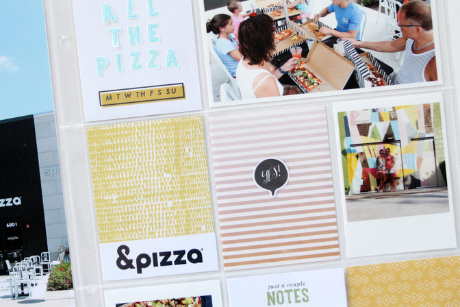
Then I typed up some thoughts about &pizza on the "just a couple notes" card, and used my Xacto knife to make a teeny slit in the other yellow patterned card and just slipped the ampersand paperclip through the slit.
Here's another look at the full thing:
Thanks for taking a peek!
Oh, and fun fact: this project was made using JUST elements from the Lost River main kit!
Supplies: Journaling + filler cards – Lost River Documenter Kit; vellum alpha stickers – Lost River Documenter Kit; ampersand paperclip – Lost River Documenter Kit


Comments
Sign in or sign up to comment.
3 comments
love your thought process. thanks for the step by step.
Replies to Sarastella
Sign in or sign up to reply.
Great project, like all the process!
Replies to maggytzin
Sign in or sign up to reply.
Love the blues and yellows....Nice LAyout
Replies to Shes_Crafty
Sign in or sign up to reply.