For even more 10th Anniversary fun, we've rounded up ten of our favorite past blog challenges. We've asked our current Creative Team to share their take on these fun challenges, and we hope you'll play along too!
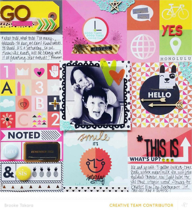
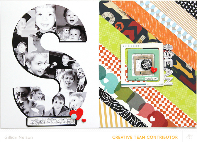
In this challenge from NSD 2015, we asked you to go bold on your next project. Brooke Takara and Gillian Nelson shared their interpretations on that challenge.
And here's Creative Team member Carson's take on this past challenge:
I’m so happy to be here in celebration of ten awesome years of Studio Calico goodness! I would never have become the avid crafter I am without the products and community that Studio Calico has offered over the past decade, and I would certainly have never met so many wonderfully supportive and talented friends that push me to create and express myself every day through this medium of pretty paper. I’m here today to return the favor and push you to “GO BOLD” for your next project. It doesn’t matter whether you’re making a layout, a documenter spread, or a card, push yourself to go beyond your comfort zone with color, contrast, and technique!
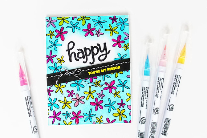
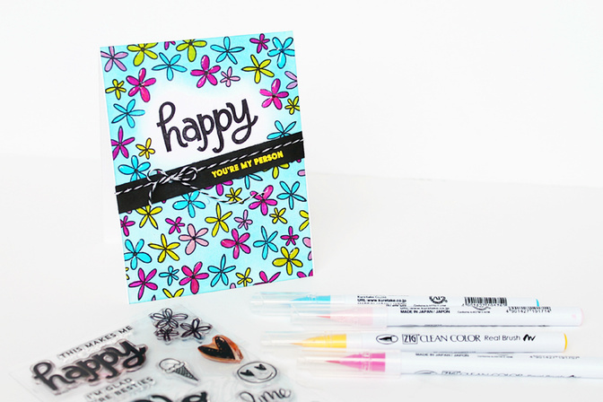
I created a colorful card with a 70's vibe for this challenge using the brand new Doodle Stamp Set by Jasmine Jones. This set has a really fun junior high meets Brady Bunch vibe and is perfect for using on a bold and colorful card.
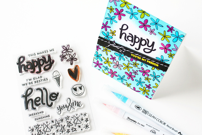
When I think of going bold, I immediately think large font and strong contrast. I achieved both of these by stamping the “happy” sentiment in a jet black waterproof ink. To keep the contrast going I stamped the flower pattern builder stamp in the same black ink across the page, leaving some breathing room around the sentiment.
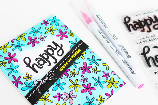
From there it was all about pumping up the color to create a striking and vibrant background. I blended some Color Theory "Clear Blue" ink across the card, being careful to keep the sentiment highly contrasted and surrounded by white. I then used my Zig watercolor pens to color in the individual blooms. Next, I layered a black diagonal sentiment strip across the front of the card with an embossed yellow “You’re My Person.” Even then the card needed more contrast, so I added the black and white twine bow to offset all the crazy color behind it.
I give you permission to cut loose and go a little crazy with this project, friends. Start with some strong contrast, layer in a whole bunch of color, and don’t stop until your project is literally jumping off the page. I can’t wait to see what you create!
Let's see how you go bold for a chance to win a $10 GC to the Studio Calico shop! When you complete this challenge, upload it to the member gallery and leave a link to your project in the comments below. See all of our 10th Anniversary challenges here.


Comments
Sign in or sign up to comment.
22 comments
@carson, do you love those clean color brush pens?
Here is my layout in lime green and red
https://www.studiocalico.com/galleries/204647-believe-you-can
Replies to CeliseMcL
Sign in or sign up to reply.
Here is my go at the challenge
https://www.studiocalico.com/galleries/204695-take-me-to-the-sea
Replies to ginny
Sign in or sign up to reply.
You inspired me to make a card using watercolor but my first attempt didn't go so well. Luckily I found a better technique from Jennifer McGuire using an acrylic block and distress ink. https://www.studiocalico.com/galleries/204734-you-re-more-awesome-than-unicorns-card
Replies to terriblygreat
Sign in or sign up to reply.
Using bold colors of cardstock to mimic the Arizona flag: https://www.studiocalico.com/galleries/204737-arizona-authentic
Replies to penny
Sign in or sign up to reply.
https://www.studiocalico.com/galleries/204816-c-on-the-slide
Replies to mandy1632
Sign in or sign up to reply.
I usually use a white cardstock base for all my pages, so for the "go bold" challenge I didn't use any at all, instead filling the page entirely with a photo and patterned paper: https://www.studiocalico.com/galleries/204829-beauty
Replies to LifeInMotion
Sign in or sign up to reply.
I went with a bold title here:
https://www.studiocalico.com/galleries/204837-4th-of-july
Replies to jenjeb
Sign in or sign up to reply.
I used bold black digital stamps for my background:
https://www.studiocalico.com/galleries/204865-monterosso
Replies to CristinaC
Sign in or sign up to reply.
I love that bold colored card in the Been and Gone Document kit. I wish I had 10 more of them!
https://www.studiocalico.com/galleries/204896-journey
Replies to TerryB
Sign in or sign up to reply.
Oh what fun I had with this. Of course I chose to make a card. I combined this challenge with the watercolor challenge and I ended up having my initial attempt be my "practice" on how to get my stamped image to be more defined from the watercolor, with my embossing becoming a muddled mess. I ended up stamping some parts with dye inks and then stamping with pigment ink and embossing to get my images defined. Parts of the water colored background gave it a more organic look.
https://www.studiocalico.com/galleries/205010-i-love-you
Replies to Brinkleyboy
Sign in or sign up to reply.
When I think of citrus naturally bold bright colors come to mind. This stamp set just begs to try out all of the different stamps and sayings.
https://www.studiocalico.com/galleries/205011-my-main-squeeze-birthday-card
Replies to Brinkleyboy
Sign in or sign up to reply.
Here is another card I created using this challenge. A little more involved but I love the outcome.
https://www.studiocalico.com/galleries/205012-you-re-a-peach
Replies to Brinkleyboy
Sign in or sign up to reply.
https://www.studiocalico.com/galleries/205013-orange-you-thoughtful
So with this last card I guess I made a set. Such fun! I might give these away and make some more.
Replies to Brinkleyboy
Sign in or sign up to reply.
Inspired by Brooke's layout, I grabbed that Daffodil paper:
https://www.studiocalico.com/galleries/205071-what-s-up
Replies to Kristi_
Sign in or sign up to reply.
https://www.studiocalico.com/galleries/205303-crop-10-go-bold
Replies to cporter
Sign in or sign up to reply.
Here's my take on going bold, bold numbers on the titlecard and the story behind the pictures in the spread is bold.
Thank you for the challenge!
https://www.studiocalico.com/galleries/205304-vecka-11
Replies to JaneD
Sign in or sign up to reply.
I used up a bunch of die cuts on this page:
https://www.studiocalico.com/galleries/205386-totally-brilliant
Replies to CristinaC
Sign in or sign up to reply.
I usually stick to smaller scale elements so this was a bit of a challenge for me mentally. I stamped a bold title using the Sydney alphabet stamp in this layout:
https://www.studiocalico.com/galleries/205389-the-swing
Replies to jenwong
Sign in or sign up to reply.
I am not that much of a bold creator so this challenge took some time. https://www.studiocalico.com/galleries/205402-with-happy-hearts-we-gather-together
Replies to Cards4Ever
Sign in or sign up to reply.
On this LO I have gone bold by Printing a large photo on cardstock.
Thank you for the challenge!
https://www.studiocalico.com/galleries/205414-young-love
Replies to JaneD
Sign in or sign up to reply.