Hi, guys! I prepared a color challenge for you today! I based this palette on my May project, Weekend.
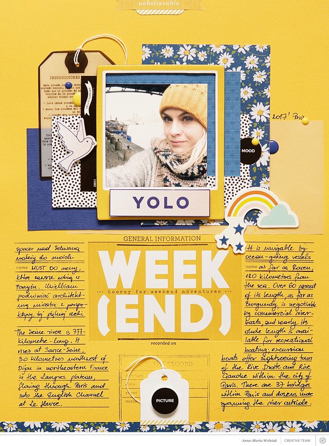
Here you have a lovely, bright palette built on a contrast between the bold color, yellow, and two shades of blue: pale blue and navy. Everything is mixed with black and white accents.
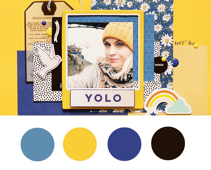
All of these colors can be found in your kits, printables, and, I'm sure, also in your spring photos. I want you to create a layout, card, or a documenter spread using this palette. This is your task in this challenge. 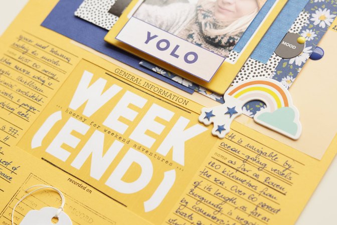
Have fun and be brave with these bright colors. :) When you complete this challenge, upload it to the member gallery and leave a link to your project in the comments below. See ALL of the crop challenges here.


Comments
Sign in or sign up to comment.
35 comments
I used some older PL cards (Camelot, Planetarium) for this spread. Love this color combination!
https://www.studiocalico.com/galleries/202821-pl-2017-week-9
Replies to jenwong
Sign in or sign up to reply.
Thank you girls for your participationand so many nice words under this post!
Your projects are outstanding!
Replies to aniamaria
Sign in or sign up to reply.
Finally got a chance to upload this layout. Thanks for the chance.https://www.studiocalico.com/galleries/202847-moscow-mule
Replies to CathyDoerr
Sign in or sign up to reply.
I have made a layout about my eldest son's graduation using old papers found in my stash. The colours for this challange are perfect as yellow and blue are the colours of the Swedish flag, often used at graduations and other holidays.
https://www.studiocalico.com/galleries/202848-sjung-om-studenten
Thank you for the challenge!
Replies to JaneD
Sign in or sign up to reply.
using bits from lots of kits and my stash
https://www.studiocalico.com/galleries/202855-easter
Replies to juliee
Sign in or sign up to reply.
Loved this challenge since I normally wouldn't think of using those colours together! :)
Here's my take: https://www.studiocalico.com/galleries/202867-you-make-my-world-go-round
although I did have to pair it with lots of white space to feel comfortable with it ;)
Replies to ScatteredConfetti
Sign in or sign up to reply.
Loved this color combo...
https://www.studiocalico.com/galleries/202890-and-they-only-went-that-one-time
Replies to NoraGriffin
Sign in or sign up to reply.
Fun color combination!
https://www.studiocalico.com/galleries/202958-night-ice-cream
Replies to kristinkristin
Sign in or sign up to reply.
I loved this challenge
https://www.studiocalico.com/galleries/202965-jump
Replies to lorebarsby
Sign in or sign up to reply.
Here's my take on this colour challenge: https://www.studiocalico.com/galleries/202989-birthday
There's a lot more white than is required.. but that's because the lined background has white in it. Other than that I tried to stick to the colours as much as possible!
Replies to wenyicraftdiary
Sign in or sign up to reply.
Really great color combination that I couldn't have pulled together myself!
https://www.studiocalico.com/galleries/202994-week-8
Replies to lisavarshine
Sign in or sign up to reply.
This was challenging as I don't use this color combo often but I love it. Thanks for the challenge.
https://www.studiocalico.com/galleries/203005-this-is-my-favorite
Replies to terriblygreat
Sign in or sign up to reply.
Here's my interpretation of this challenge https://www.studiocalico.com/galleries/203008-chihuly-at-nybg
Replies to AndreaHB
Sign in or sign up to reply.
I thought this picture was perfect for this color challenge - love the use of the bold colors for this challenge. It was fun. https://www.studiocalico.com/galleries/203016-go-girl
Replies to jennmccabe
Sign in or sign up to reply.
Great colors!
https://www.studiocalico.com/galleries/203039-yay-card
Replies to ShellyJ
Sign in or sign up to reply.