Design Tips | Great Escape
Tags:Starting with a blank page can be an intimidating way to begin a project. The following design tips are perfect for pairing with this month's "Great Escape" Kit, or just tuck them into your back pocket for a time when your creative mojo is low. Either way, we hope they’ll help inspire your next project!
Use white space to help balance elements on the page and create a pleasing design.
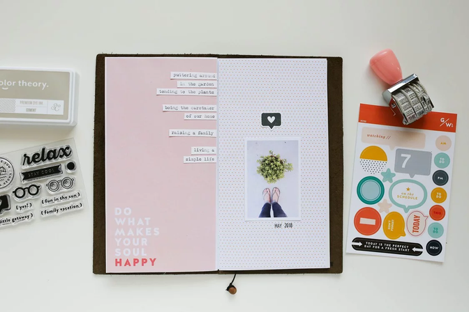
Marcy Penner used white space to her advantage to balance her spread, Simple Life. By including it on both pages of her spread, she achieved a gorgeous design!
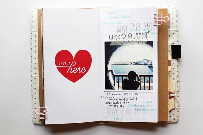
On her spread, May 2018 TN // Love It Here, Lisa Truesdell created a bold impact by grouping her photo, stamping, and journaling on the left page and leaving the right page to shine on its own. We love the result!
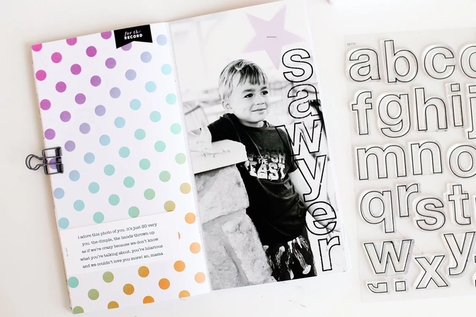
White space doesn't have to be "white." It can also be an area where you don't add any embellishing, like Kelly Noel did on the left side of her spread, Sawyer, where she featured just the pattern opposite her photo.
Use the edge. Create an interesting design by lining things up on the edge (photos, stamping, etc).
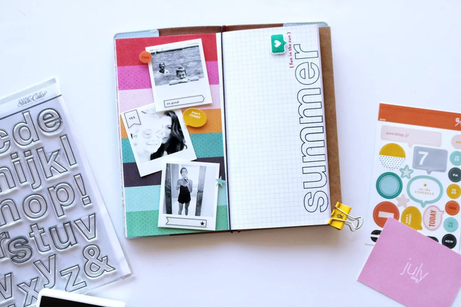
Candace Perkins created the perfect sub-title for her spread, Fun in the Sun 2018, by stamping the word "summer" along the edge of her page. This simple design perfectly balances out her three-photo page on the opposite side!
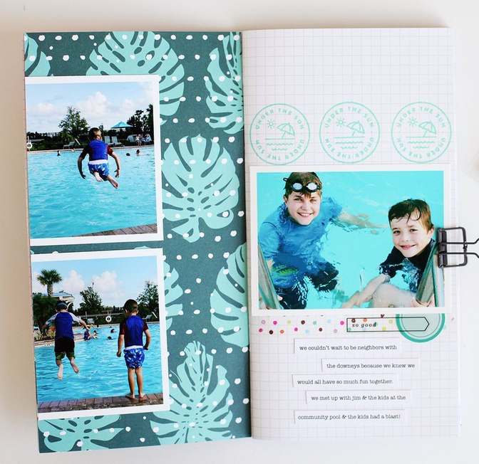
On her spread, Under the Sun, Kelly Noel let her two photos hang off the side of the left page for an interesting look. This fun technique is a great way to show off more of a patterned paper you love!
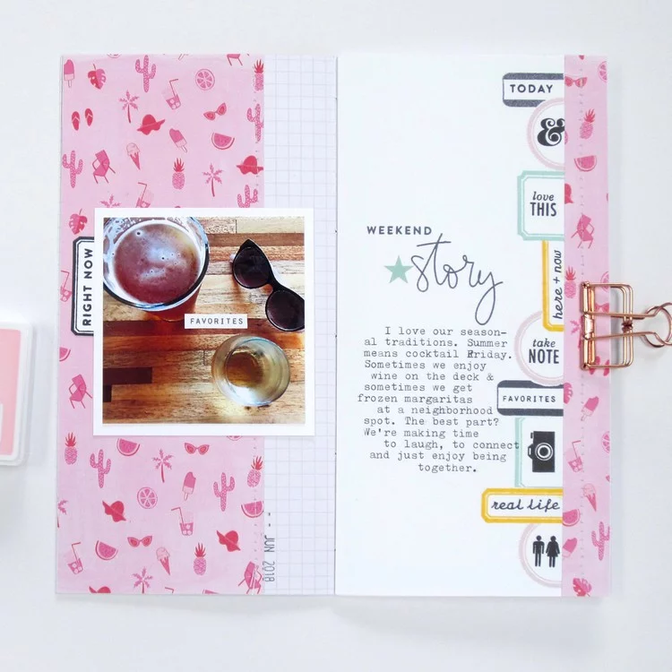
France Wisniewski lined up her series of sentiment- and icon-filled label stamps along the edge of a patterned paper on her spread, Weekend. This fun border is the perfect element for her page!
Right down the middle. Create a central design by lining things up right down (or across) the center of your page.
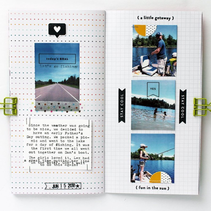
Mel Blackburn created a central design on both pages of her spread, Stay Cool. By lining up her photos and journaling in a vertical line, she created a stunning, well-balanced design!
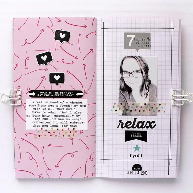
On her spread, Relax, Mel Blackburn featured a central design again—this time lining up her embellishments, photo, and stamping down the center of her left page. This stacked technique creates stunning results!
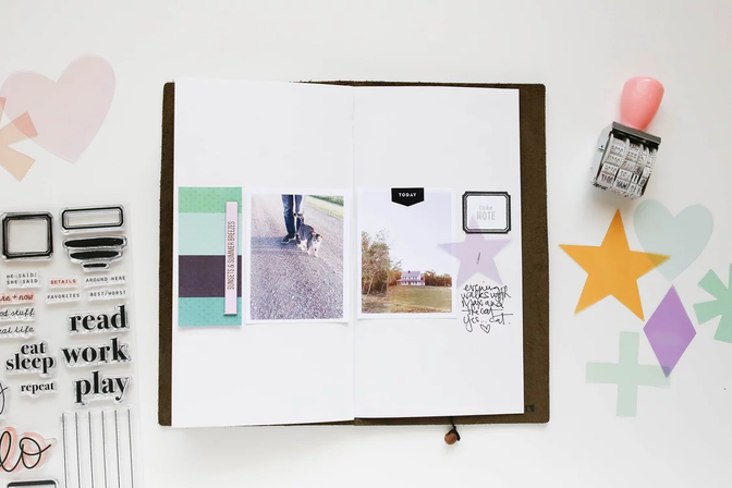
"Down the middle" doesn't have to be restricted to just vertical or single-page designs. Marcy Penner lined up her elements horizontally across both pages of her spread, Take Note, and the result is gorgeous!


Comments
Sign in or sign up to comment.
1 comment
Great tips! Thanks for all the inspo!
Replies to tburley
Sign in or sign up to reply.